MY ROLE
UX + Visual Design
THE PROJECT
Apple Watch Prototype
THE RESULT
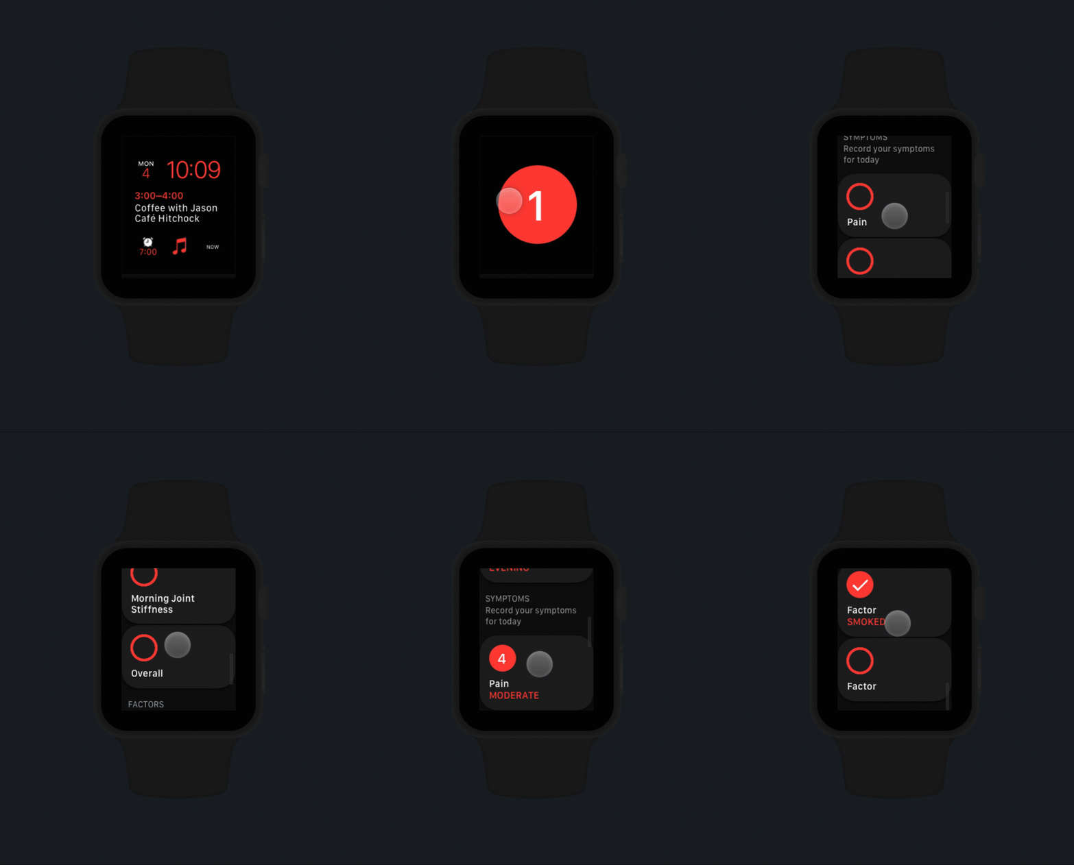
Fully realized Apple Watch prototype
LillyPlus is an iPhone app for improving outcomes for patients of Eli Lilly. Its goal is to improve a patient’s chance of success by:
Improving adherence via customized reminders and alerts to both take and refill their medication on time
Preparing for better conversations with their doctors via using tools to enable better data collection
My team was tasked with creating an exploratory prototype for LillyPlus on Apple Watch. We had one month to complete the design and development of the prototype.
Background
The Project
In order to support the main objectives of LillyPlus, we focused our application on two key scenarios:
Medication tracking to improve adherence. Create tools to help patients stay on top of taking their medication.
Symptom recording to prepare for better patient-doctor conversations. Create tools for patients to track their symptoms on a regular basis to facilitate accurate communication with their healthcare provider.
My Responsibility
As design lead, I was responsible for the overall design strategy, as well as the user experience and visual design of the application. I also worked closely with our engineering team to realize the designs into a fully-functional Apple Watch application.
My Approach
This project was the first Apple Watch application for Eli Lilly, and the first Apple Watch application for the Seattle studio of Deloitte Digital. As such, it was my responsibility to establish not only a design solution, but a shared understanding of Apple Watch.
I begin every project with establishing a need for the project. “Because the client asked for it” is not enough! There must be good reason for a system to exist, in its specific iteration. For example, if what we are creating could just as easily be accomplished on the iPhone app, there is no need for an Apple Watch companion app.
“There must be good reason for a system to exist.”
With that in mind, I begin my work by establishing three core principles for the application: efficiency, focus, and feedback.
Efficiency
Prioritize speed over detailed input. Fast, focused, and minimal interactions.
Focus
Constrain each screen to do one thing well. Micro-interactions to aid understanding.
Feedback
Provide immediate, real-time feedback for every action the user takes in-application via clear interactions and controls.
Based on these principles, and a shared understanding of the problem space, I moved forward with an initial design.
Concept 1
This concept had at least two significant concerns:
Poor Accessibility. Small tap targets may be difficult for users with joint pain or fine motor skill issues.
Poor Usability. A menu system requires Save/Dismiss actions in the app, slightly increasing the cognitive load for users.
Visual Design
My approach to visual design considered a number of elements, including typography, iconography, and color.
Icon exploration
Color decision. I created a variation of the primary brand color that retained Lilly’s distinctive red while passing accessibility guidelines.


